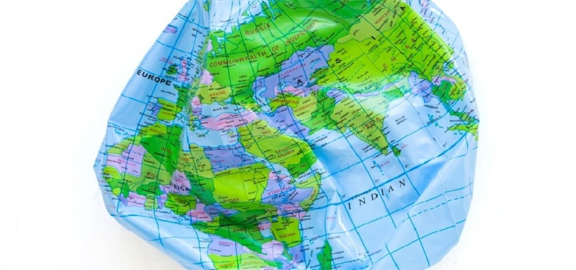
The UN General Assembly has just recommended the use of equal-area world maps. Andreea Marin, geographer and cartographer at the University of Bucharest, explains why no flat map can render the Earth without distortion, from Mercator to Gall-Peters and Equal Earth, and why the projection we choose shapes the way we see the world.
At the UN General Assembly on 4 September 2026, member states voted: 164 in favour, 1 against (the United States), and 6 abstentions (Estonia, Georgia, Lithuania, Republic of Moldova, Serbia and Ukraine), to adopt a resolution recommending the use of equal-area projections, when relative size matters, as they preserve true surface area proportions [1]. This decision brings a centuries-old dilemma back into focus: what mathematical compromise must a cartographer make when representing the Earth?
Maps are never neutral
Maps are often regarded as sources of precise and objective information. Over time, we have been taught to view maps as true representations of geographic reality, which gives them a high degree of credibility. However, maps are not always as neutral as they appear. As cartographer Judith Tyner observed in her study on persuasive cartography in 2015 (Persuasive Cartography, pp. 1087–1095), maps have sometimes been used to convey or reinforce messages rather than to communicate objective geographic information. Examples range from wartime propaganda during both World Wars and the Cold War to mid-century corporate lobbying charts and modern activist campaigns [2].
The idea remains relevant today. In a briefing to the African Group at the UN ahead of the vote, Togo’s Foreign Minister, Robert Dussey, stated that “A map is never neutral […] It shapes perceptions, influences how the place of peoples and continents in the world is understood, and may, sometimes from the earliest years of schooling, perpetuate representations that do not correspond to geographic reality” [3].
Every point, line or polygon drawn on a map represents a decision by the cartographer: What information is included? What data is omitted? What scale is chosen? How are elements symbolised? And, above all, what map projection is used?
All these choices influence what we ultimately see. Moreover, a map can also be viewed as a product of the social, political or economic context in which it was created.
The UN resolution neither bans the Mercator projection nor mandates its replacement. Instead, it encourages governments, schools, international organisations and technology companies to use the “Equal Earth” projection [4] and other maps that preserve true surface-area proportions.
A problem with no perfect solution
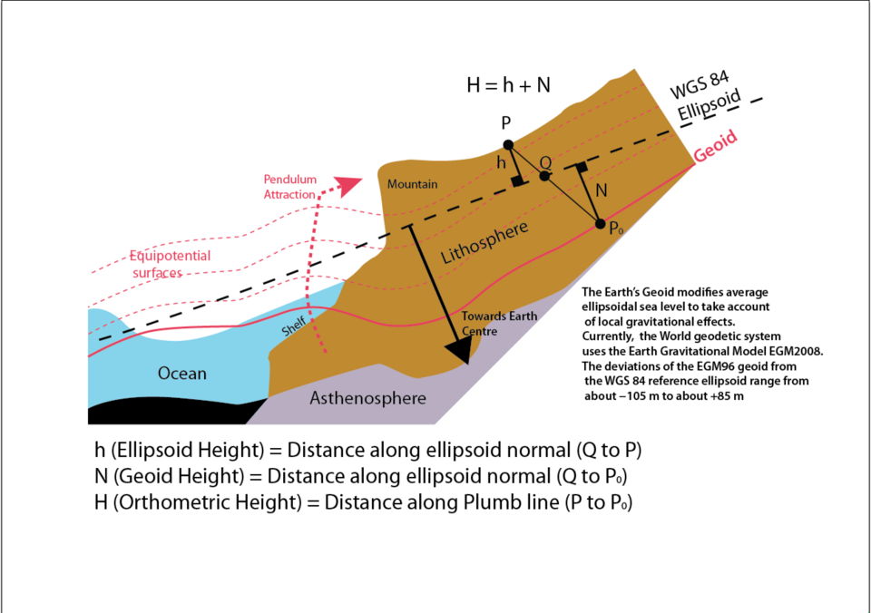
The Earth is not a perfect sphere. Because of its rotation on its axis, the Earth is slightly flattened at the poles and bulges at the Equator, a shape known as a spheroid or ellipsoid. Furthermore, the uneven distribution of mass within and on its surface causes slight variations in the planet’s gravitational field. The reference form that takes these variations into account is known as the geoid. Projecting this shape of the Earth onto a flat surface poses a genuine challenge: it cannot be done without distortion. Imagine the Earth as an orange: if you peel it and try to lay the skin perfectly flat on a table without tearing or deforming it, you face a situation similar to that of translating three-dimensional geographic reality onto a two-dimensional plane. Mathematically speaking, there is no geometric transformation that can preserve areas, distances, directions or angles all at once.

From Mercator to Equal Earth
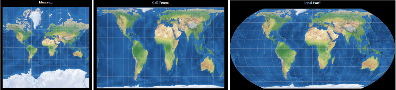
The Mercator projection was created by the Flemish cartographer Geert de Kremer, known as Gerardus Mercator, in 1569. It was designed primarily to solve a practical problem of maritime navigation: straight lines on the map correspond to constant compass directions, allowing sailors to maintain their course without complex calculations. Its major advantage, therefore, is that it preserves angles and directions. Its significant drawback, however, is the distortion of surface areas: as one moves away from the Equator toward the poles, landmasses appear increasingly large. On a Mercator map, Greenland appears similar in size to the African continent, even though Africa is approximately 14 times larger.
Although the Mercator projection was designed for navigation, over time and through widespread use it became the standard representation of the world in many school materials, the mass media, the digital environment and official documents. And just like that, without our even realising it, a specific visual configuration of the world became familiar to billions of people. In response to these surface distortions, equal-area projections were created to preserve the true ratio between continental landmasses. The Gall-Peters projection, first described by James Gall in 1855 and popularised by Arno Peters in the 1970s, was promoted as the alternative to the Mercator projection. It accurately preserves the relative surface areas of continents and countries; consequently, Africa and South America appear much larger than they do in the Mercator projection, more closely reflecting their actual sizes. But there is a trade-off here as well! To preserve surface area, the projection alters the shapes of the continents, making them appear more elongated and less familiar to the eye. In other words, the Gall-Peters projection does not eliminate distortion; it merely shifts it elsewhere.
The search for the most equitable projection continued. In 2018, an international team of cartographers created the Equal Earth projection as a visually pleasing alternative to the Gall-Peters projection. This projection, recently recommended by the UN, succeeds in preserving the true proportions of surface areas, though with moderate shape distortion to maintain a visually balanced appearance.
Every map has its purpose
No projection can perfectly render the Earth’s curved surface onto a flat plane; each one entails one or more compromises.
No map projection is “wrong”; they simply serve different purposes.
In this context, the UN’s recent recommendation to encourage the use of equal-area projections does not automatically imply the rejection of other specific projections. Rather, it serves as a reminder that maps do not merely indicate the location of a country, city or river; they also tell a story about them, and the choice of projection can influence the message conveyed.
References
[1] https://news.un.org/en/story/2026/09/1168284
[2] https://press.uchicago.edu/books/HOC/HOC_V6/HOC_VOLUME6_P.pdf
[3] https://robertdussey.com/en/adopting-new-world-map-that-shows-true-size-of-all-countries/
[4] https://equal-earth.com/equal-earth-projection.html
[5] https://commons.wikimedia.org/wiki/File:Earth%27s_Geoid_compared_with_WGS84_ellipsoid.png
[6] https://map-projections.net/
Header image credit: Designed by Freepik – Magnific.com
Further reading
- How does drought propagate along a European river? Lessons from the Danube (Andreea Marin)
- European Commission launches ‘Europe’s eyes on the Earth’ roadshow
- European satellite uncovers new map of Milky Way
- EU proposes €16 billion budget for space programme
- The superpower will simulate the world
This post is also available in:
Leave a Reply